|
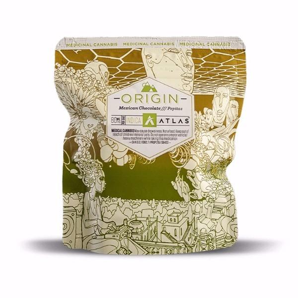
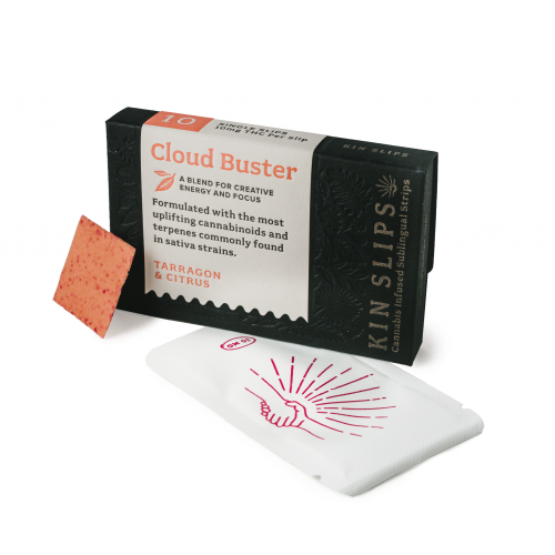
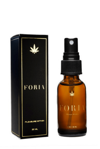
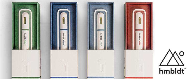
Happy 4-20! Recently, a friend of mine from San Francisco visited armed with a variety THC infused consumables. Those from Wisconsin bring cheese, New Yorkers bring bagels, Californians (even the transplants apparently), bring cannabis. The legalization of marijuana in different states in the union has has had a wide effect on distribution, available potency, and, perhaps, not so obviously, branding. Indeed, like it’s more accepted cousins in viceland, tabacco and alcohol, cannabis being designed and packaged in this country in an effort to appeal not only to your dopamine receptors, but also your aesthetics and brand loyalty. A multi-million dollar industry is on the rise and as that number gets higher, so might you. With big business at stake, companies are putting more thought into how their product is packaged and presented. Move over nickel bag, something sexier has hit the streets! Nimbus Edibles utilizes original artwork on their packages customized to match the particular effect intended by the product. This package above contains edibles designed to promote "relaxation, healing and well being". On the outside you get a line drawing of someone with an ethereal fantasy popping out of his (her?) head, and above you have a honey comb pattern with other beings (heads only) floating in the sky. What is also interesting about Nimbus is that the brand credits the artists featured on the package in print. You can now aspire to have your art featured on a really nice bag of (edible) weed! Kin Slips cannabis infused slips come sleekly packaged in a tiny dark blue box embossed with the imprints of leaves of all shapes and sizes. The typography and paper selection make this package of melting cannabinoid strips feel very apothecary-like, luxe, and designed for the on-the-go cannabis consumer who might feel right at home at Urban Outfitters. Foria Weed lube utilizes elegant packaging that speaks to the natural aphrodisiac nature of cannabinoid products. Sophisticated and restrained, the package appeals to a refined user who appreciates a fine wine, a fine cigar, and a fine lubricant that will get them high and at the same time appeal to their visual sensibilities. KY has never been so high. Finally, the ultra modern and sleek package of the Dosist brand dose pens brings to mind the minimal packaging of the “Help” brand remedies, as well as the clean pharma packaging that is so well-satired in the work of Damian Hirst. It is a clean, ultra-designed brand that utilizes a lot of white space, a system of color coding, and a san serif font that espouses a cold air that only medical products can provide. Stoned never looked so Swiss.
Does the new wave of packaging in the bourgeoning cannabis market appeal to you? Are you more inclined to sample some if you haven't already? Leave your comments below!
0 Comments
|
 RSS Feed