|
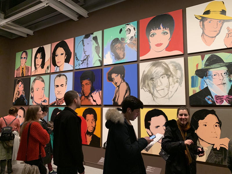
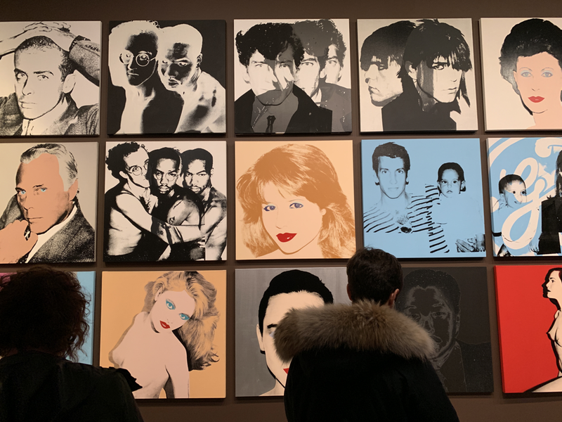
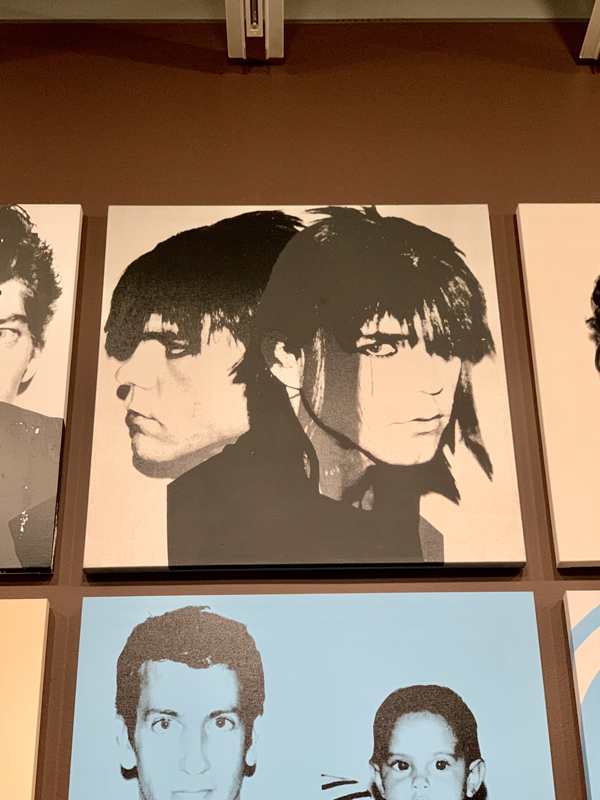
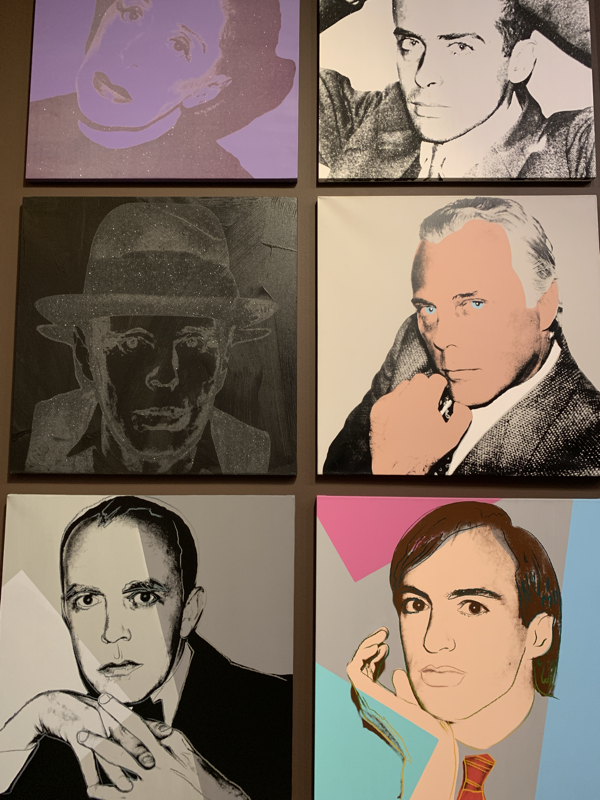
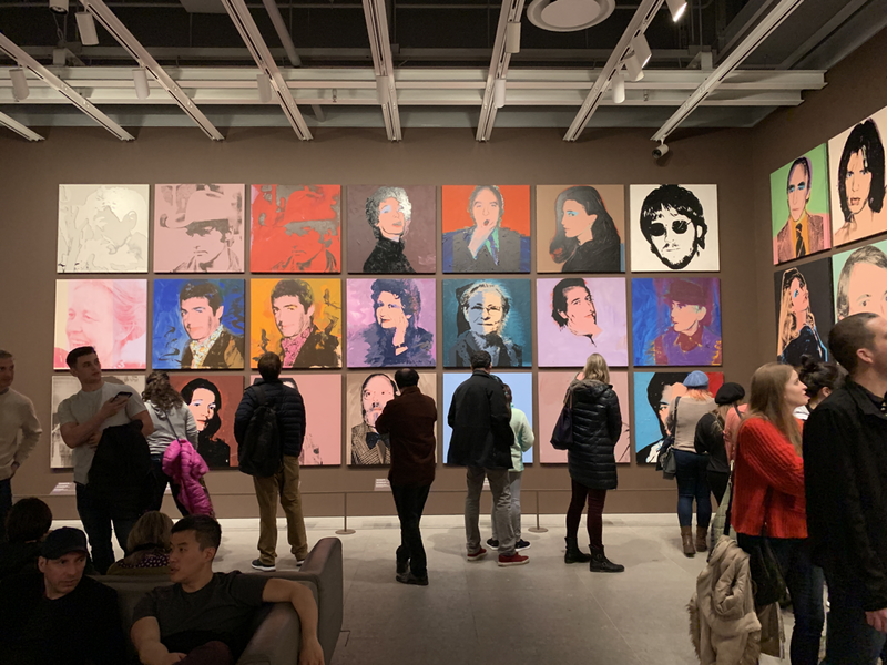
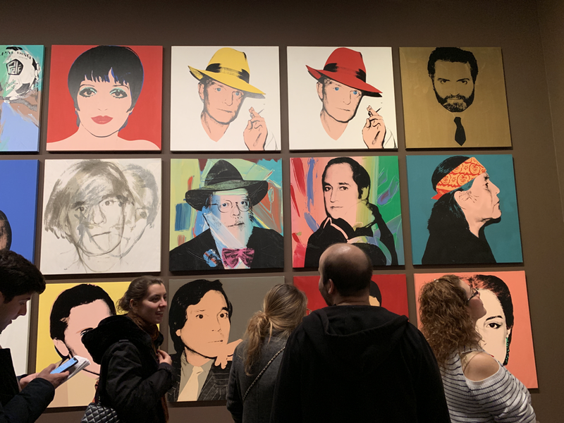
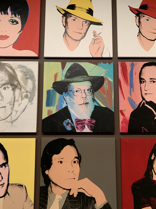
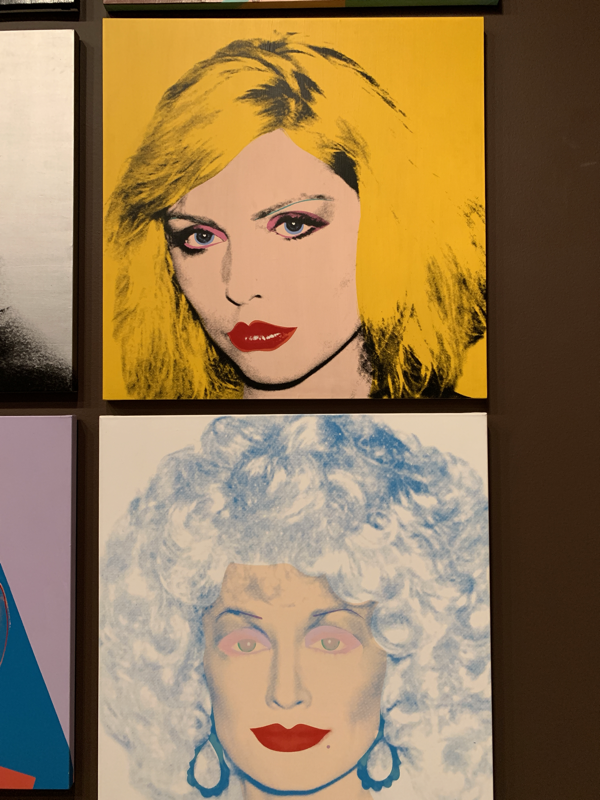
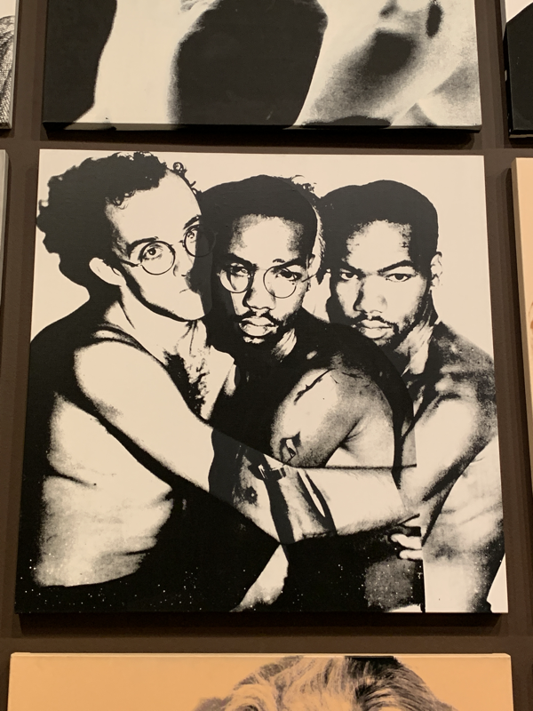
Andy Warhol painted Liz Taylor, Marilyn Monroe, and Truman Capote with a fan-boy, almost stalker-like, affection (Capote had to tell Warhol to refrain from calling him daily as he once did). As his own super stardom rose, the affection from artist to muse became mutal and the glitteratti of the era sought out the artist to be forever immortalized in Warholian style. True to his “Good Art is Good Business” mantra, Warhol would later take commissions from wealthy, less iconic, clientele who needed to have own original Andy. With this Warhol himself had become an icon in the church he once worshipped — the church of Fame. This gallery, part of the current Warhol survey at The Whitney, serves as a cross section of the art/entertainment/social stratosphere that Warhol catered to as THE portrait artist of his time.
Standouts in this gallery include Joseph Beuys, Dolly Parton, Henry Geldzahler, and Versace, all for different reasons. If Warhol was around today who would he be painting? Moguls of the internet? Bad boy heads of state? Hollywood royalty? Tell me in the comments below who you think would make the cut... Ciao for now.
1 Comment
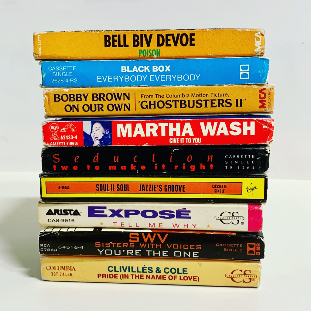
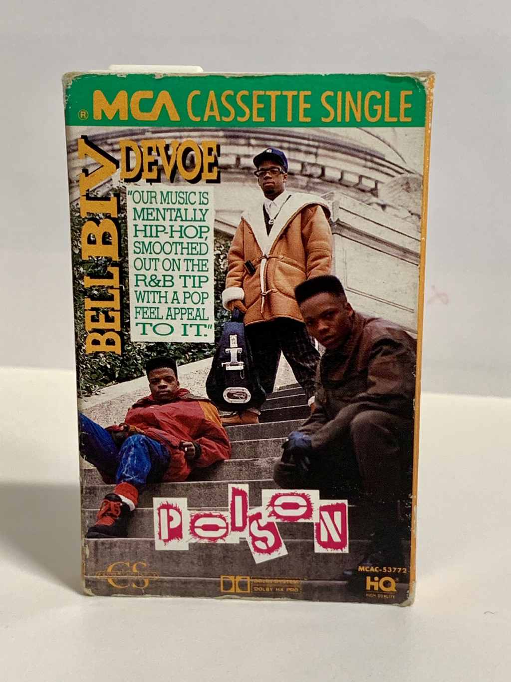
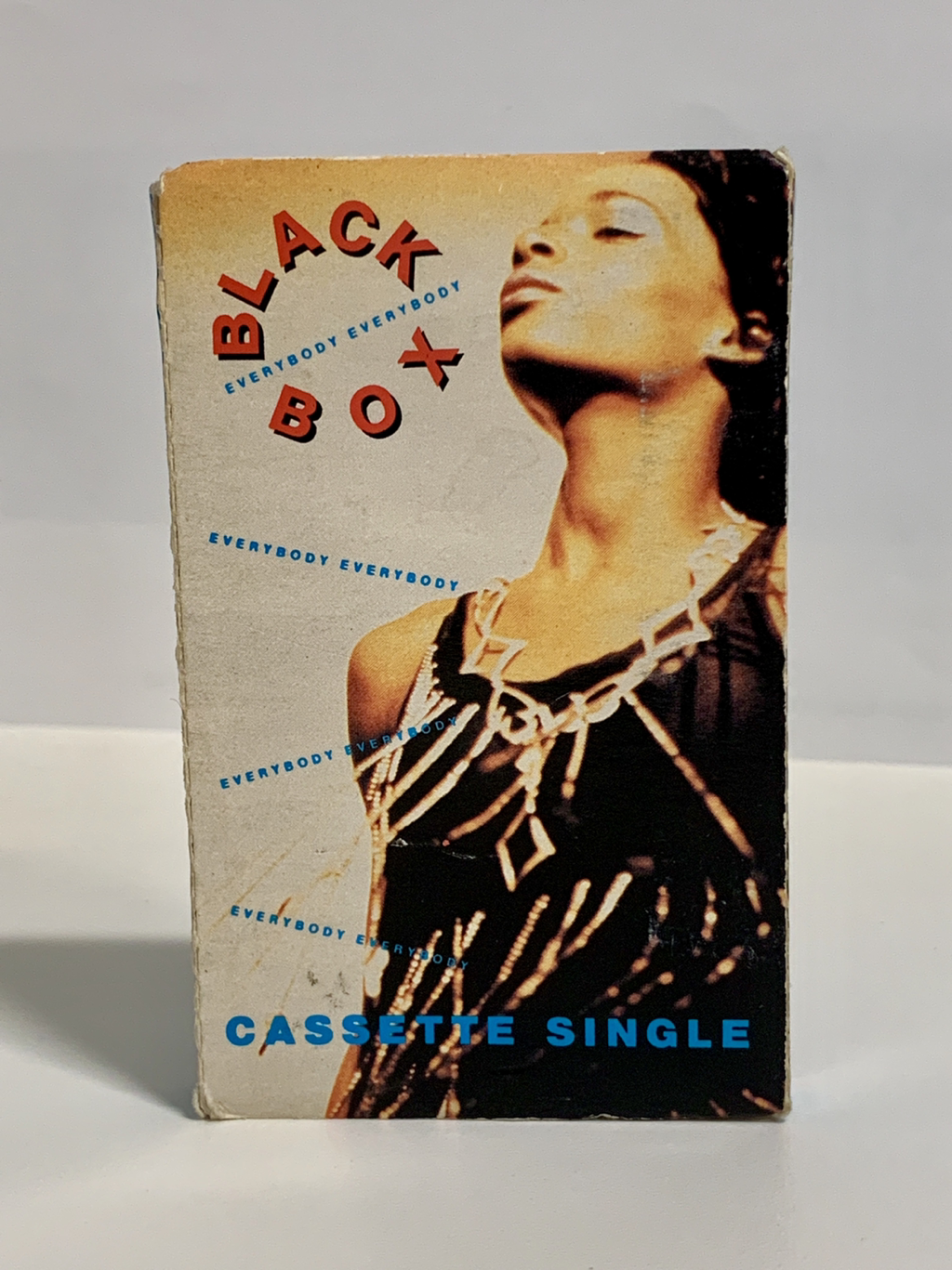
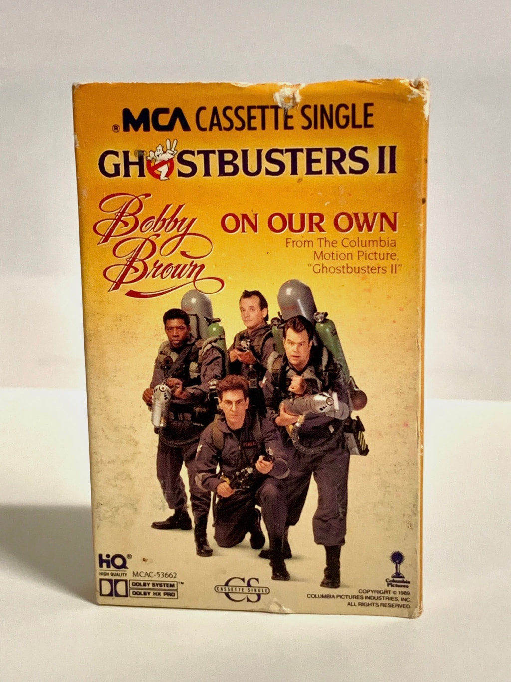
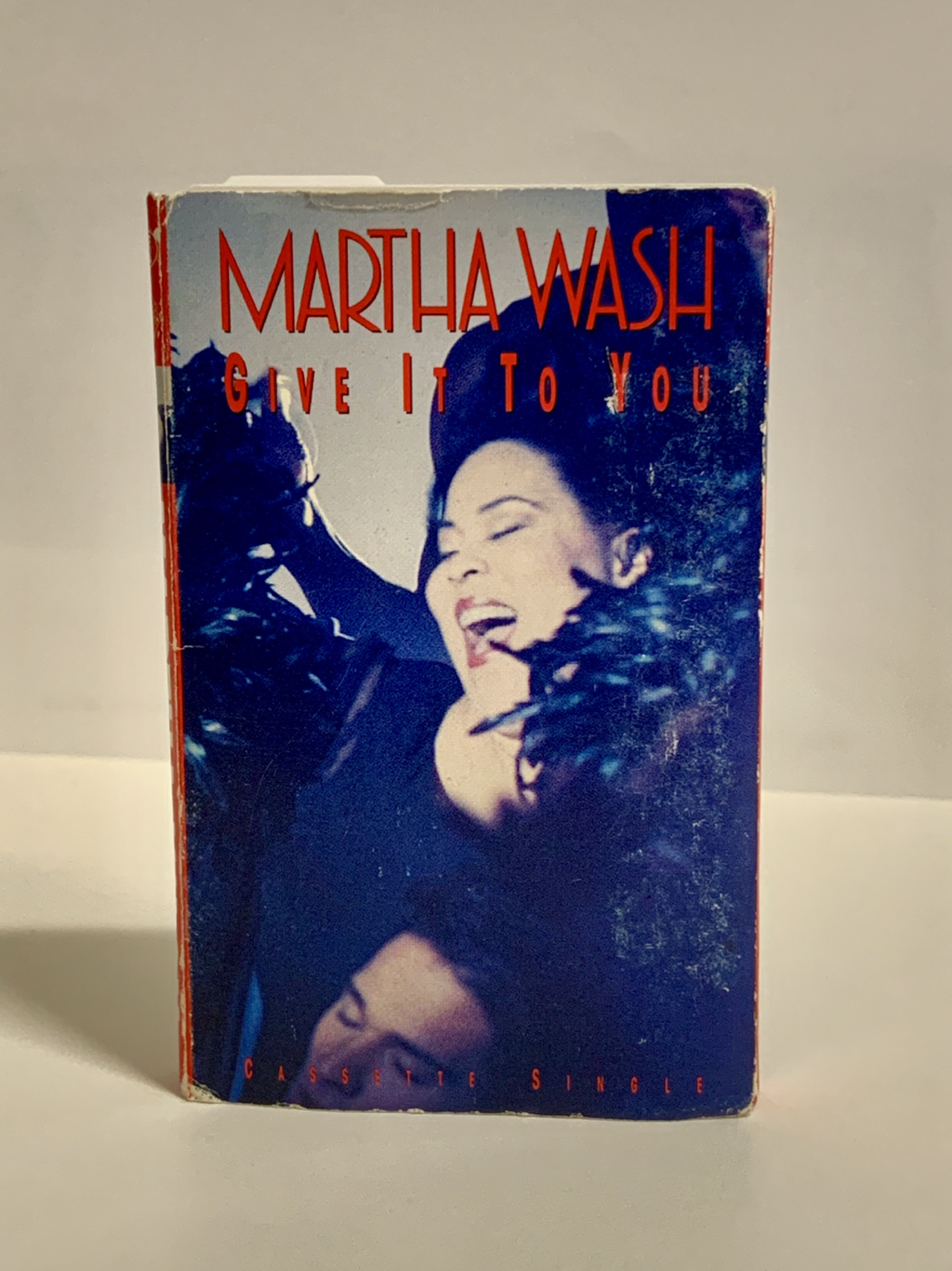
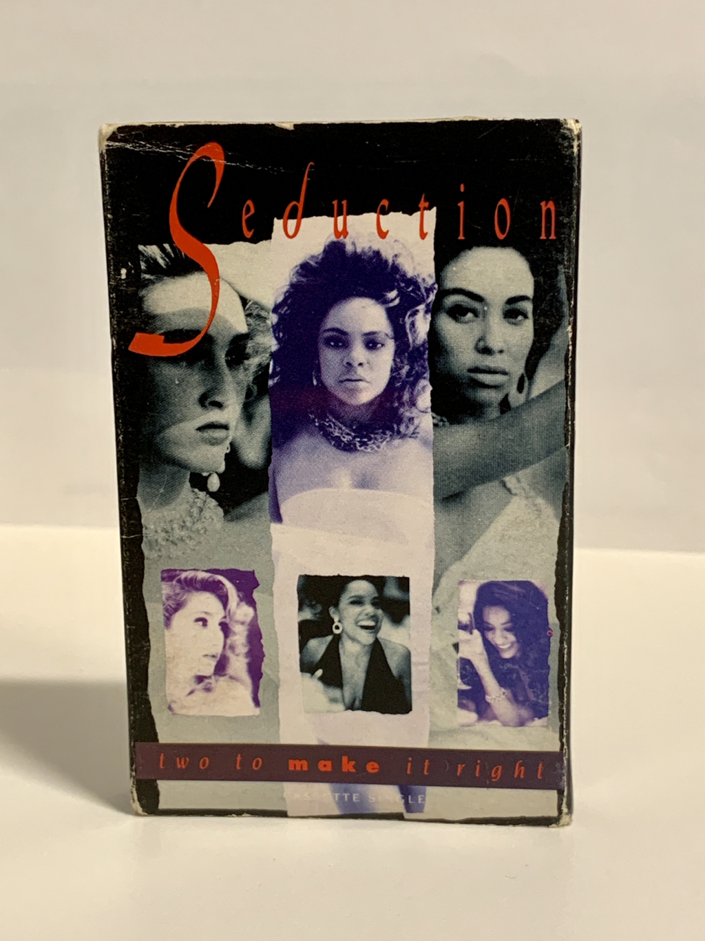
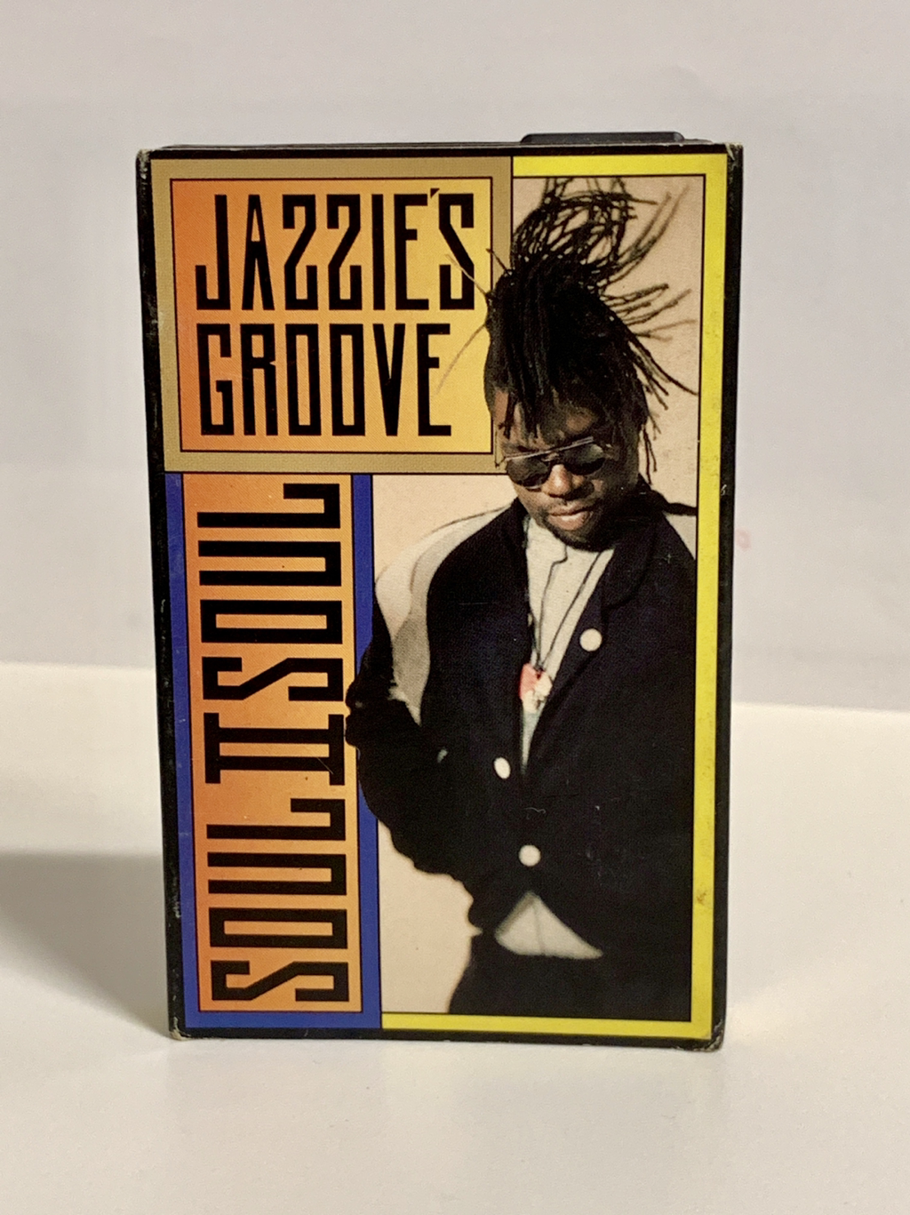
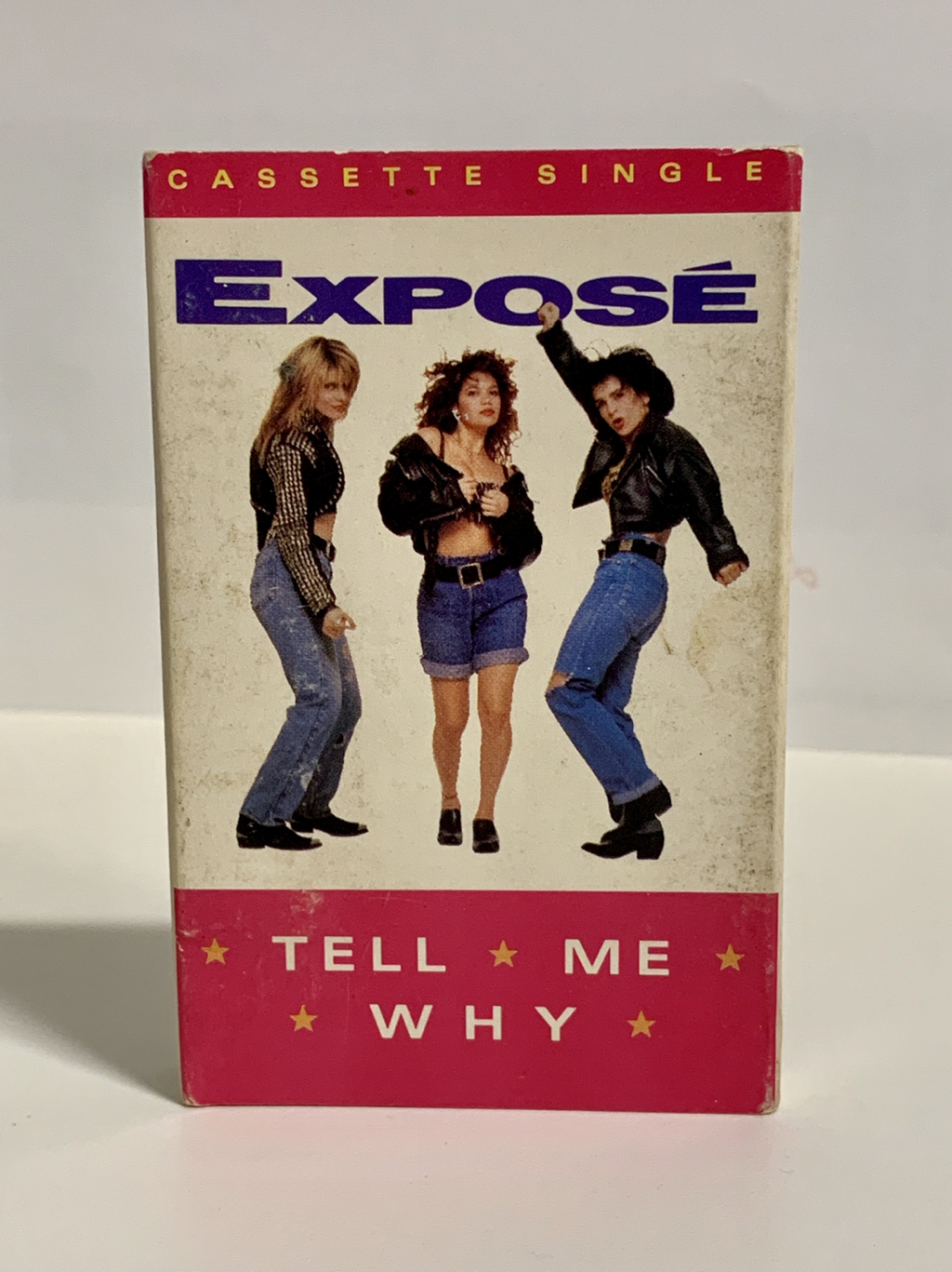
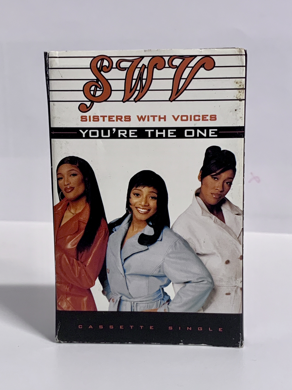
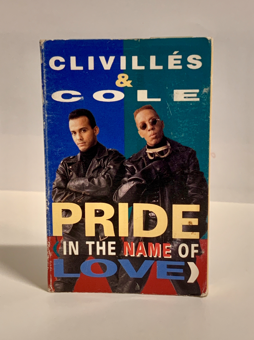
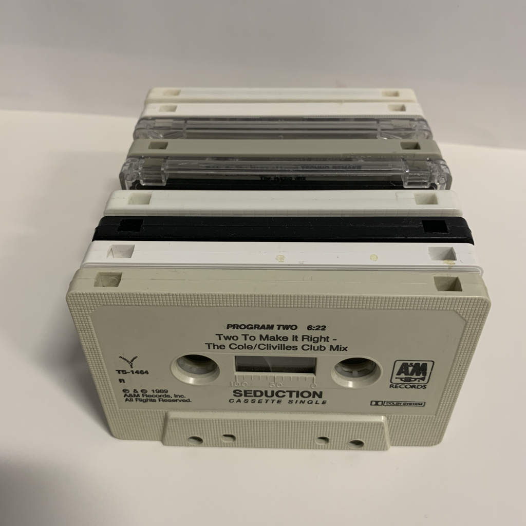
I recently was reunited with some old friends — my cassette singles from the late 80’s and early 90’s. See, back in the day we bought singles, individual songs on cassettes that you would buy at Sam Goody, or Tower Records, or HMV, or fill in record store of your choice. If you were around then, I am preaching to the choir. But I know there are a handful of you to whom the concept of going out and buying music, let alone a single song on audio cassette is as foreign as an emoji-less text. Alas entertainment was not always at your fingertips! When I opened the treasure chest o’ music that my friend had fostered through the years, out came a veritable time capsule dating back to the late 80’s to the early 90’s. A flood of memories hit me as I fingered these archaic objects and I was immediately transported to that time in my life. I also became aware of the person I was at that time and the vestiges of my identity that have either faded away or are still clinging on. Look at the selection of music below and you’ll see my interest in R&B, House Music, Freestyle, Hip-Hop - ‘twas the 90’s and that was the lewk and I was cool. Next stop amazon.com to get a boombox to play these things on. Do they still make those?! Do you have music from your past? If so what formats? Do you treasure these objects? Let me know in the comments section below.
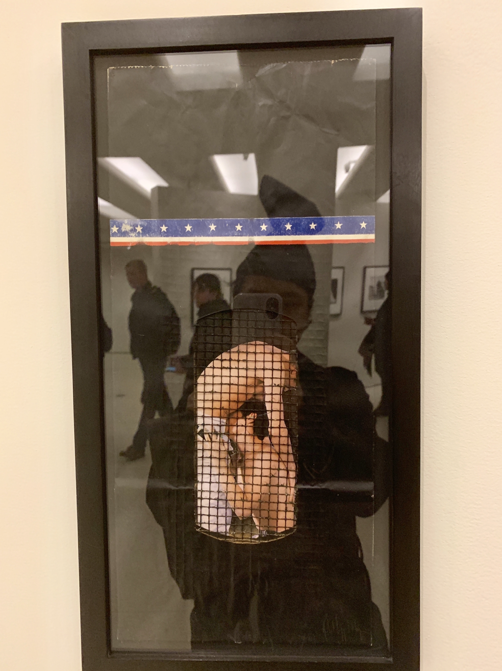
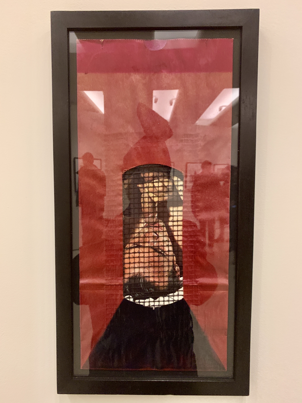
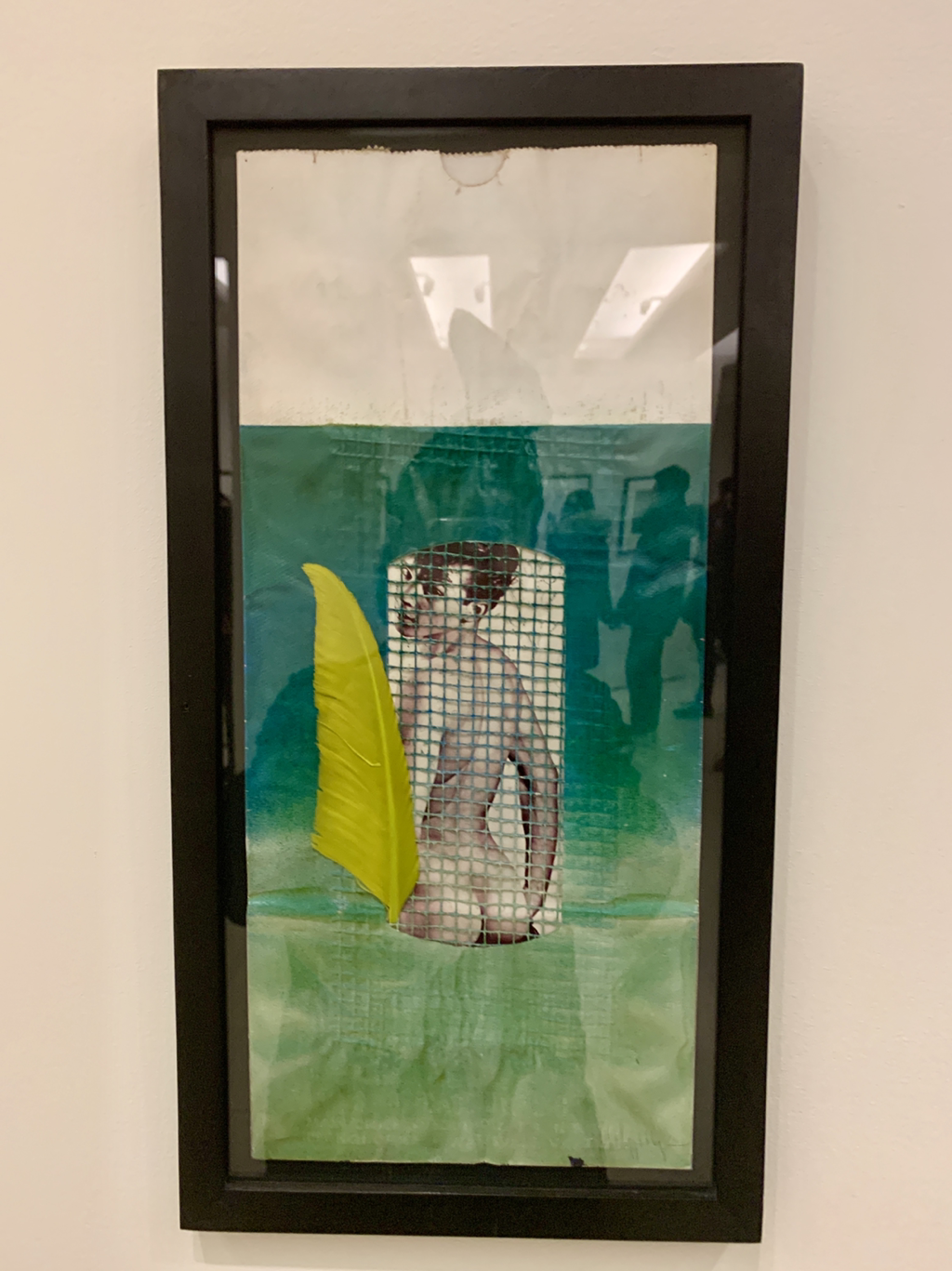
I went to The Guggenheim and came across Implicit Tensions: Mapplethorpe Now, a stunning, comprehensive show of the photographer’s work. In addtion to the powerful hallmarks of his body of work, including his portraits, S&M series, and floral studies, there were pieces that I hadn’t encountered previously. Three such pieces are Black Bag, Red Bag, and Green Bag. All created in 1971, the three pieces exemplify Mapplethorpe’s interest in the male form and sexuality that would play a monumental role in his artistic production. I thought the use of the grid (a spray painted part of a potato sack) was intresting from a both a formal and conceptual point of view. Also I found his use of banal objects resourceful and inspiring. The artworks possessed a youthful, obsessive quality about them. It was great to discover these pieces that served provide a sketch the artist as a young man.
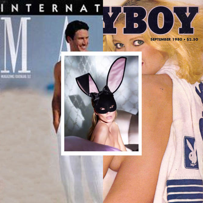
When I was a kid I would peruse my papa’s Playboy magazines and think to myself, MAYBE NEXT YEAR…. You see, I got no boners, no tinglies, NO NOTHIN'. I thought that I just hadn’t reached that stage of puberty yet. The stage when I’d finally realize what the big deal was about seeing nude women on the printed page. Only later, when issues of the catalogue International Male arrived in our mailbox (many thanks to the mailman of my youth!), did I realize that the time had come. Ultimately, time wasn’t the issue — my budding sexuality was.
Many years later, I found myself eagerly purchasing a Playboy with fevered anticipation. (My papa would be SO proud!) This visceral impulse wasn’t driven by a desire to get some whack-off material, though. Instead, my urgent need for straight-boy porn was fed by a sex symbol whose power reigned over the straights and gays alike: Kate. Kate Moss came into my consciousness in the ‘90s, with her work for Calvin Klein. Waif-y and titty-free, she was a soft compliment to the hardness that Marky Mark (né Mark Wahlberg) embodied in the ck one ads of that era. While I longed for the masculinity that he oozed, Kate— small, delicate, almost in need of care— was the perfect foil to his cute but brutish demeanor in that campaign. Soon after, she became one of the original “Supermodels”, that storied international gang of muses whose job it was to seduce an unsuspecting public into glutinous consumption of finite resources. Lol. With this anniversary Playboy cover, Moss shows us all that she’s still got what it takes to sell a cover, henny. And, as a maker of things, I really can see what Moss has accomplished. Kate Moss, Inc. works on many levels. She is beautiful and glamorous and nothing if not aspirational: straight boys and gay girls want to fuck her, straight girls want to be her, and the gay boys…? The gay boys just fucking love her. To me, The Kate cover of Playboy symbolizes that “one day” that I was hoping for as a young pre-adolescent. It eventually arrived, maybe not in the way that anyone expected; but, finally, I got a boner from a copy Playboy magazine. What a refreshing experience to hang out with my friend Ray last weekend. They brought me up to The Cape, Ray’s native turf. The comfort with which Ray shapeshifts is always astounding to me. Their androgynous body lends itself to assuming either extreme of the sexes, or just down the middle where Ray likes to play. Heads turned and alot of people complimented their look, but then again, it was Provincetown. How gender non-binary people fare in “real” life might be another story. Or is it? Recently another friend of mine came back from North Carolina where he had an acting gig for a few weeks. He remarked on how many ambiguous people he came across down there, and what’s more interesting, he said they were just part of the fabric in the community. Kinda remarkable for the South, I think. Are things changing? The media seems to be awash with proponents from both sides. I’ll keep on wearing my boots and dresses because that’s how I am comfortable, at least for today. Who knows about tomorrow…
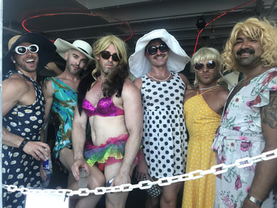
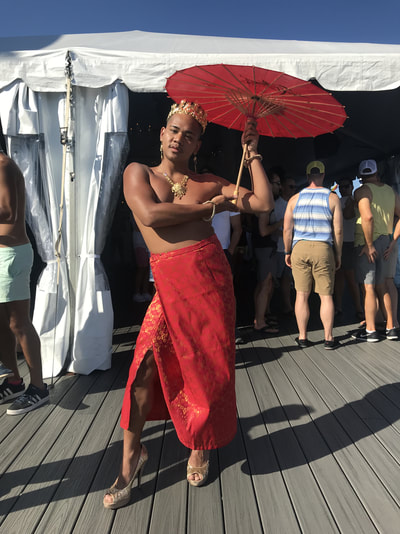
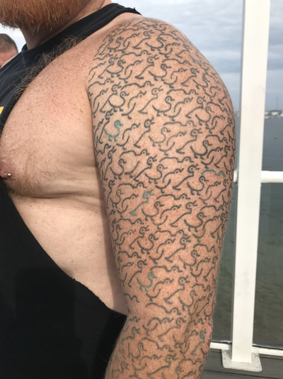
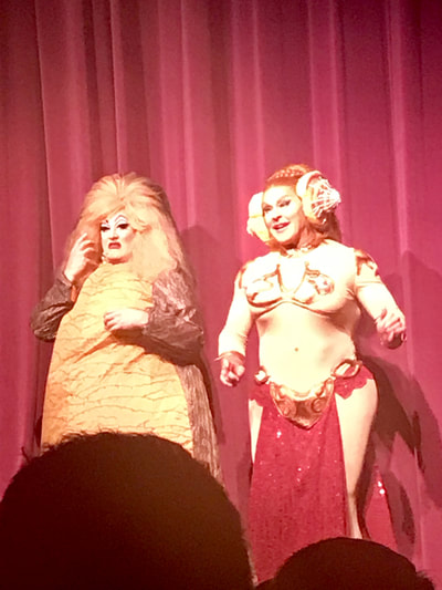
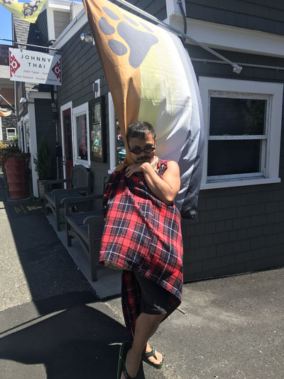
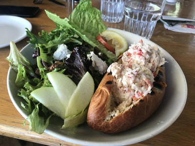
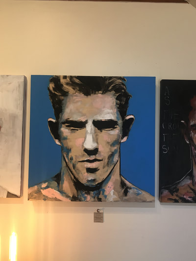
Last week I went to Provincetown for the first time. Ironically, I landed in the middle of "Circuit Week" and left on the first day of "Bear Week". Accustomed to the bear crowd as I am, I felt a bit like an anthropologist studying the behavior of a foreign species. Local inhabitants aside, I did enjoy all that this legendary bastion of gay life had to offer. From beautiful scenery to gender-bending muscle queens to drag queen all-stars — my visit to P-Town is not one I will soon forget. Below are just a few shots of my short time there.
Have you been to Provincetown? When did you go and what was your experience like? One of my favorite developments, as the patriarchy slowly crumbles under the weight of its own toxic masculinity, has been the mainstreaming of makeup for men. Reams have been written about the growth of the men’s cosmetics market. Think pieces abound about men’s use of products like concealer and foundation to project youthfulness in an increasingly competitive and youth-obsessed job market. That’s great — Seriously. But what I’m really here for, tbh, is beauty boys. The past few years have seen the proliferation of beautiful boys (like James Charles, Manny Gutierrez, and Bretman Rock) all over social media rocking the fuck out of some makeup. Not the utilitarian use of cosmetics to correct perceived imperfections; but, the painting of a face in such a way to project a mood, a character, an emotion. The idea that I have available to me another set of tools with which to express myself is kind of revolutionary to me.
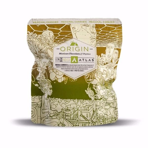
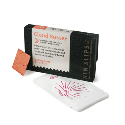
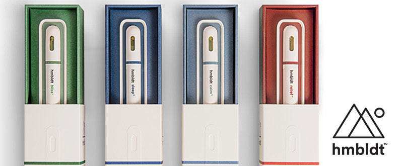
Happy 4-20! Recently, a friend of mine from San Francisco visited armed with a variety THC infused consumables. Those from Wisconsin bring cheese, New Yorkers bring bagels, Californians (even the transplants apparently), bring cannabis. The legalization of marijuana in different states in the union has has had a wide effect on distribution, available potency, and, perhaps, not so obviously, branding. Indeed, like it’s more accepted cousins in viceland, tabacco and alcohol, cannabis being designed and packaged in this country in an effort to appeal not only to your dopamine receptors, but also your aesthetics and brand loyalty. A multi-million dollar industry is on the rise and as that number gets higher, so might you. With big business at stake, companies are putting more thought into how their product is packaged and presented. Move over nickel bag, something sexier has hit the streets! Nimbus Edibles utilizes original artwork on their packages customized to match the particular effect intended by the product. This package above contains edibles designed to promote "relaxation, healing and well being". On the outside you get a line drawing of someone with an ethereal fantasy popping out of his (her?) head, and above you have a honey comb pattern with other beings (heads only) floating in the sky. What is also interesting about Nimbus is that the brand credits the artists featured on the package in print. You can now aspire to have your art featured on a really nice bag of (edible) weed! Kin Slips cannabis infused slips come sleekly packaged in a tiny dark blue box embossed with the imprints of leaves of all shapes and sizes. The typography and paper selection make this package of melting cannabinoid strips feel very apothecary-like, luxe, and designed for the on-the-go cannabis consumer who might feel right at home at Urban Outfitters. Foria Weed lube utilizes elegant packaging that speaks to the natural aphrodisiac nature of cannabinoid products. Sophisticated and restrained, the package appeals to a refined user who appreciates a fine wine, a fine cigar, and a fine lubricant that will get them high and at the same time appeal to their visual sensibilities. KY has never been so high. Finally, the ultra modern and sleek package of the Dosist brand dose pens brings to mind the minimal packaging of the “Help” brand remedies, as well as the clean pharma packaging that is so well-satired in the work of Damian Hirst. It is a clean, ultra-designed brand that utilizes a lot of white space, a system of color coding, and a san serif font that espouses a cold air that only medical products can provide. Stoned never looked so Swiss.
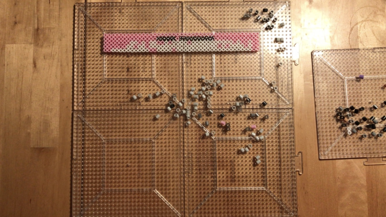
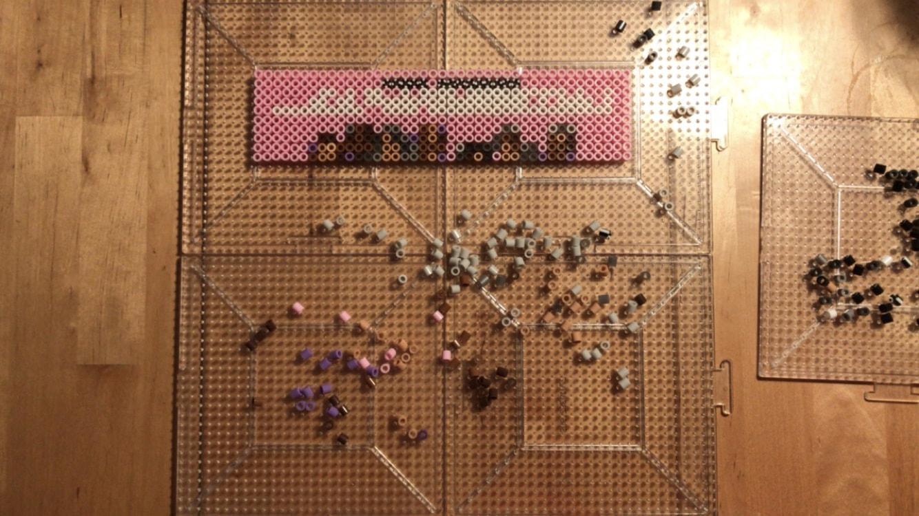
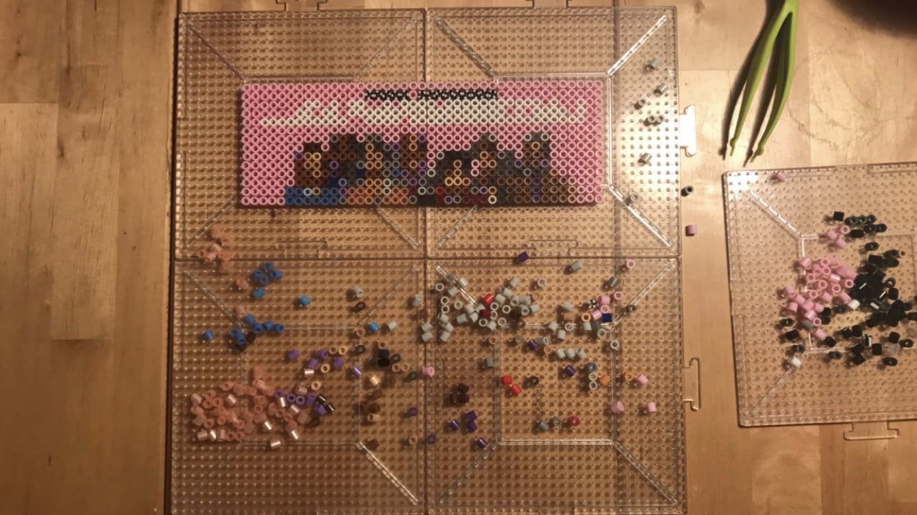
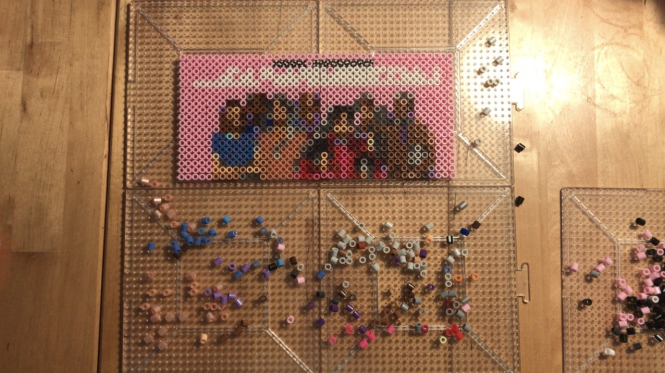
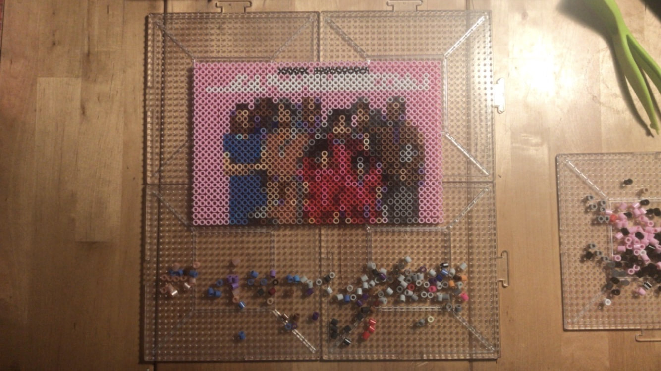
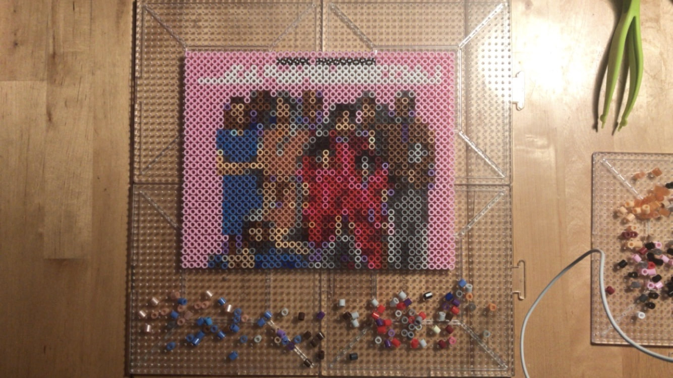
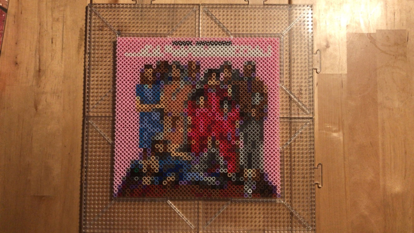
Does the new wave of packaging in the bourgeoning cannabis market appeal to you? Are you more inclined to sample some if you haven't already? Leave your comments below! The family portrait that is used as the promotional image for "The Royal Tenenbaums" has always been a favorite of mine. Each character, with the exception of Royal himself, gazes at the viewer with an insouciant demeanor that is less-than-inviting, to say the least. This coupled against the soft pink background that frames the image really speaks to the tone shifts that are integral to the film's character.
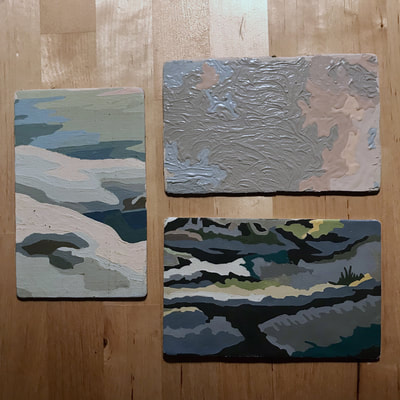
"I always wanted to be a Tenenbaum" is a quote from the film. Spoken by Eli Cash, the words echoed my own sentiments about the family of geniuses. And while each member had their individual winning traits (athleticism, business acumen, writing ability), if I had to choose I would be Margot for sure, an artist whose solemn existence is fill with mystery and pathos wrapped in a brilliant package of a fur coat. Who is your favorite Tenenbaum and why? Respond in the comments below. For more process photos of my work, be sure to view my Instagram Story on the regular. |











 RSS Feed